The Art of Infographic Design: Turning Data into Visual Stories

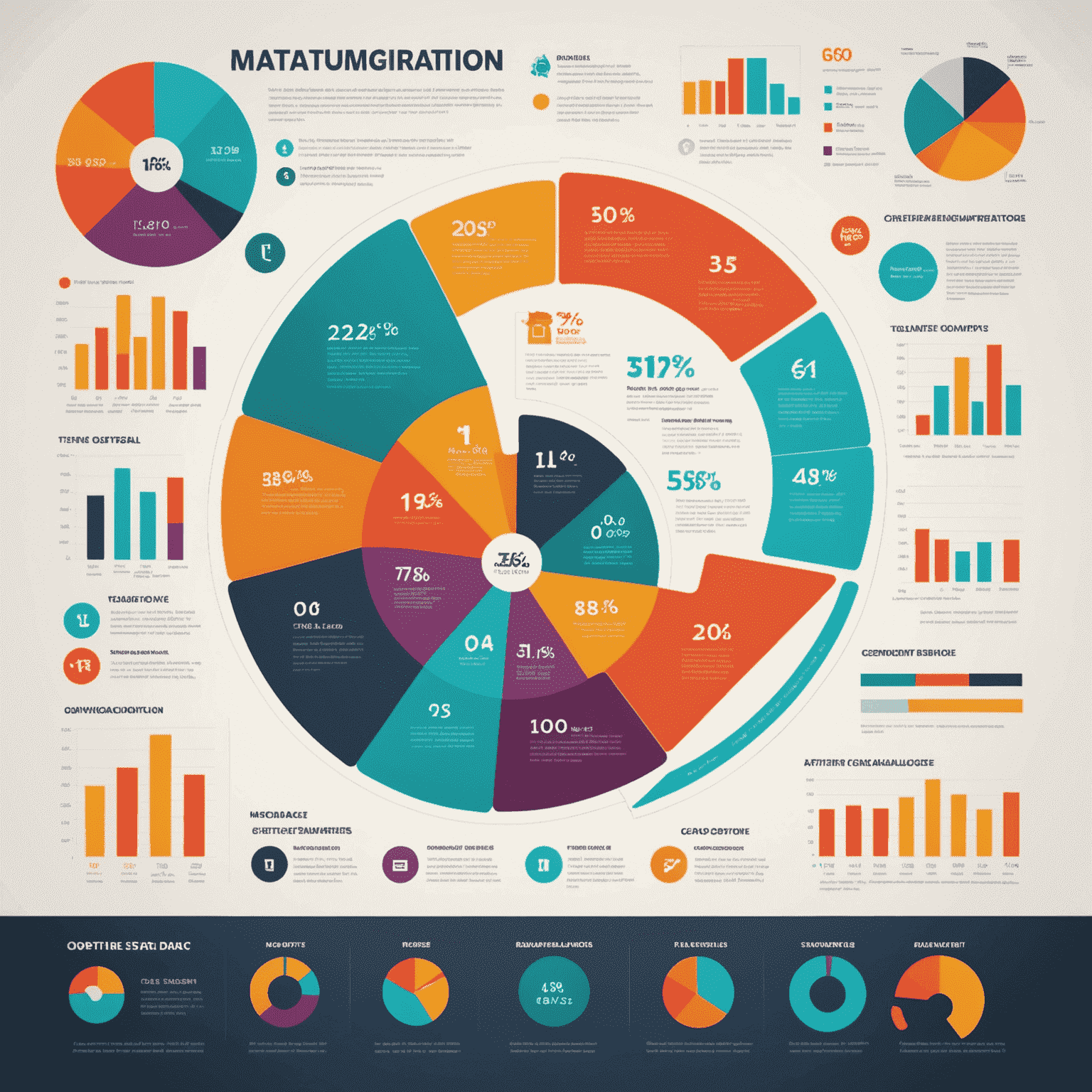
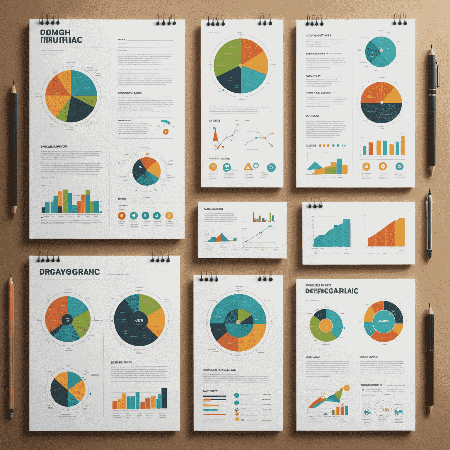
In today's information-rich world, the ability to transform complex data into easily digestible visual content is a valuable skill. Infographics have become a powerful tool for communicating ideas, statistics, and processes in a way that captures attention and enhances understanding. Let's dive into the art of infographic design and explore how to create compelling visual stories from raw data.
Understanding the Basics
Before we delve into the creative process, it's essential to grasp the fundamental elements of effective infographic design:
- Clear hierarchy of information
- Consistent color scheme
- Appropriate use of typography
- Balanced layout
- Relevant and impactful visuals
The Creative Process
- Define Your Objective: Clearly identify the main message or story you want to convey.
- Gather and Analyze Data: Collect relevant information and identify key points that support your narrative.
- Sketch Your Concept: Start with rough sketches to plan the overall layout and flow of information.
- Choose Your Visual Elements: Select appropriate charts, graphs, icons, and illustrations that best represent your data.
- Design with Purpose: Use color, typography, and white space to guide the viewer's eye and emphasize important information.
- Refine and Polish: Iterate on your design, ensuring clarity, consistency, and visual appeal.

Best Practices for Infographic Design
- Keep it Simple: Don't overwhelm your audience with too much information. Focus on key points.
- Use Visual Metaphors: Represent concepts with relatable imagery to enhance understanding.
- Maintain Consistency: Use a cohesive color palette and style throughout your infographic.
- Tell a Story: Structure your infographic with a clear beginning, middle, and end.
- Cite Your Sources: Always include references for your data to build credibility.
- Optimize for Sharing: Design with social media in mind, considering aspect ratios and file sizes.
Tools for Infographic Creation
While professional design software like Adobe Illustrator is popular among designers, there are also user-friendly online tools available for those new to infographic design:
- Canva
- Piktochart
- Venngage
- Infogram
- Easel.ly

The Impact of Well-Designed Infographics
When done right, infographics can:
- Increase engagement with your content
- Improve information retention
- Simplify complex concepts
- Enhance brand awareness
- Drive traffic and social shares
By mastering the art of infographic design, you can transform dry data into captivating visual stories that resonate with your audience. Whether you're a marketer, educator, or business professional, the ability to create compelling infographics is a powerful addition to your skillset in today's visually-driven world.
Remember, great infographic design is about finding the perfect balance between information and aesthetics. It's not just about making data look pretty – it's about making it understandable, memorable, and actionable.